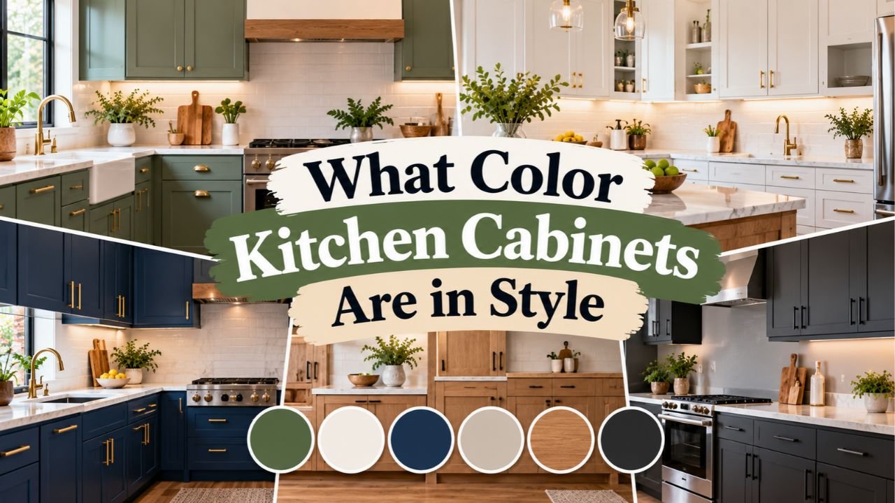
What Color Kitchen Cabinets Are in Style? Top Finishes and Shades
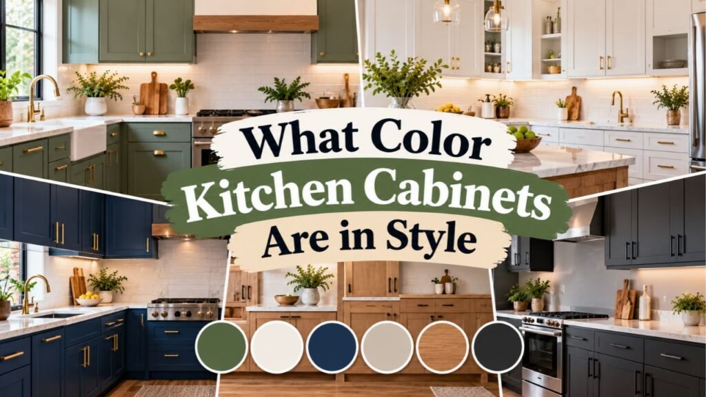
Natural wood stains in light and medium oak, creamy warm whites, earthy sage and olive greens, and grounded warm neutrals like mushroom, taupe, and khaki lead current kitchen cabinetry design. Homeowners and kitchen designers have shifted away from stark, icy all-white and cool blue-gray cupboards in favor of organic textures, muted botanical greens, and high-contrast two-tone island pairings.
Picking the wrong paint or stain for your cupboards is one of the costliest mistakes in a home remodel. Because cabinetry takes up the largest visual footprint in the room and accounts for roughly 25 to 40 percent of a total kitchen renovation budget, choosing a fading fad color or a stark shade that clashes with your flooring can make a brand-new remodel look dated right away and hurt your home’s resale appeal.
Choosing a grounded, well-balanced cabinet finish gives your kitchen decades of staying power while making the room feel warmer and more inviting every day. The right shade works harmoniously with your natural window light, hides daily fingerprints around drawer pulls, and lets you refresh the room years later simply by swapping hardware or wall paint rather than refacing the doors.
Recent U.S. remodeling survey data confirms a historic shift at the top of the color chart. According to the 2026 U.S. Houzz Kitchen Trends Study of 1,780 renovating homeowners, stained wood cabinetry (29 percent) officially overtook white (28 percent) as the most popular cabinet choice in America after jumping six percentage points year-over-year, while off-white holds steady at 15 percent and green (6 percent) moved ahead of gray (5 percent).
What stood out to me when reviewing both the Houzz survey and the National Kitchen and Bath Association (NKBA) design reports is how strongly pros and homeowners agree on nature-inspired palettes. Looking closely at what color kitchen cabinets are in style shows that 86 percent of NKBA designers point to earthy greens as the leading color family, while 78 percent highlight deep blues as a top choice for islands and accent cabinetry.
One technical detail that catches many homeowners off guard is how strongly kitchen lighting changes a paint swatch’s appearance. A soft mushroom taupe or creamy off-white that looks balanced under showroom spotlights can easily turn muddy gray in a north-facing room or overly yellow next to warm 2700K LED under-cabinet strips.
Below, you will find a full breakdown of the most popular stained wood species, the shift from stark white to creamy off-white, top painted shades from sage green to navy blue, two-tone layout strategies, and how to test samples under your own kitchen lights before committing.
What Color Kitchen Cabinets Are in StyleRight Now?
The overarching shift in American kitchen design is a move toward warmth, organic grain, and softer contrast. After more than a decade of hospital-bright white doors paired with cool gray walls, homeowners are choosing colors drawn from nature—forest foliage, raw timber, river stone, and warm clay.
Why Natural Wood Tones Have Taken the Number One Spot
For the first time in years, natural wood kitchen cabinets outrank painted white cupboards among renovating U.S. homeowners. Unlike the heavy, orange-tinted honey oak or shiny red cherry cabinets of the 1990s, modern wood cabinetry highlights raw, low-sheen grain finished with clear matte topcoats or subtle cerused stains.
According to NKBA data, white oak is the runaway favorite among kitchen pros (favored by 51 percent of designers), followed closely by natural walnut and clear-coated hard maple. Medium wood tones account for 15 percent of all new U.S. kitchen installations, light wood tones capture 11 percent, and rich dark stains make up 3 percent. Rift-sawn and quarter-sawn white oak are especially sought after because their tight, linear grain avoids wide cathedral arches, giving both Shaker doors and flat-panel slab doors a calm, custom furniture appearance.
| Cabinet Color / Finish | U.S. Renovator Share (Houzz) | Current Trend Direction | Best Hardware & Countertop Pairings |
| Stained Wood (All Tones) | 29% (15% medium, 11% light, 3% dark) | Rising fast; now #1 overall | Warm white veined quartz, matte black or aged brass pulls |
| Classic & Warm White | 28% | Cooling in stark white; shifting to soft ivory | Butcher block or marble-look quartz, brushed nickel or brass |
| Creamy Off-White | 15% | Steady staple for timeless kitchens | Soapstone, warm taupe quartz, unlacquered brass hardware |
| Earthy Greens (Sage/Olive) | 6% (86% NKBA pro backing) | Rising; has officially passed gray | Light oak accents, creamy stone counters, brushed brass |
| Warm Gray & Greige | 5% | Cool gray declining; warm greige holding | White oak floors, Carrara marble, polished nickel pulls |
| Blues, Khaki & Moody Browns | Under 5% each (78% NKBA backing for blue) | Strong growth on islands and lower runs | White quartz counters, travertine tile, burnished bronze |
The Shift From Stark Bright White to Creamy Off-White and Ivory
White cabinets are far from dead—combined, pure white and off-white still represent 43 percent of all renovated U.S. kitchens. What has changed is the undertone. The crisp, blue-undertone gallery whites that dominated the 2010s (such as stock builder whites that glare under LED lighting) are being replaced by soft cream, alabaster, warm linen, and ivory.
In my research, I noticed that homeowners want the light-bouncing brightness of a white kitchen without the cold, sterile feel of a laboratory. Shades like Benjamin Moore Swiss Coffee (OC-45) and Sherwin-Williams Alabaster (SW 7008) carry subtle yellow, beige, or greige undertones that bridge the gap between painted drywall, warm hardwood floors, and natural stone backsplashes.
Why Icy Cool Gray Is Out and Warm Mushroom and Khaki Are In
If one cabinet color family has clearly fallen out of favor, it is icy, blue-toned gray. Cool gray cabinets often drain the warmth out of a kitchen on cloudy days and clash with warm wood flooring.
In its place, designers and major paint brands have embraced earthy warm neutrals—specifically mushroom, putty, taupe, warm greige, and khaki. Sherwin-Williams even named Universal Khaki (SW 6150), a grounded mid-tone tan, its 2026 Color of the Year. These earthy mid-tones hide dust and food splatters far better than pure white while giving perimeter cabinets a relaxed, heritage warmth.
Key Takeaway: Natural stained white oak and walnut now hold the top spot in U.S. kitchen design, while painted cupboards have shifted from icy white and cool gray to creamy off-white, mushroom taupe, and warm khaki.
Top Painted Kitchen Cabinet Colors Designers Recommend
When homeowners step beyond wood stains and pale neutrals, they are reaching for saturated, dusty shades that feel connected to the outdoors. Rather than bright primary colors, the leading painted cabinets feature muted gray or brown undertones that keep the color easy on the eyes for ten to fifteen years.
Sage Green, Olive, and Smoky Jade Green Cabinets
Green is the undisputed star of painted kitchen cabinetry right now. Moving ahead of gray in national homeowner surveys and backed by 86 percent of NKBA kitchen designers, green works like a botanical neutral.
Three distinct shades of green dominate current remodels:
- Soft Sage and Pistachio Green: Gray-washed, silvery greens (such as Sherwin-Williams Evergreen Fog or Fabuwood Pistachio Green) brighten small kitchens and pair effortlessly with white quartz counters and light oak floors.
- Earthy Olive and Moss Green: Deeper yellow-brown greens bring a grounded, organic look to traditional Shaker doors, especially when paired with aged brass hardware and creamy zellige tile.
- Smoky Jade and Forest Green: Blue-undertone greens—highlighted by Behr’s 2026 Color of the Year, Hidden Gem (N430-6A), a smoky jade—add rich drama to kitchen islands, butler’s pantries, and tall bar walls.
Pro Tip: Pair green cabinets with warm metal hardware like unlacquered brass, brushed gold, or aged bronze, and incorporate at least one natural wood element—such as a walnut island top or white oak floating shelves—to keep the green looking organic rather than Minty.
Navy Blue, Indigo, and Dusty Slate Blue Cabinets
Blue remains a classic favorite for homeowners who want color without straying too far from traditional coastal or transitional style. While bright cobalt is rarely used, deep navy blue, midnight indigo, and dusty slate blue are recommended by 78 percent of kitchen professionals.
Because dark navy absorbs light, it shows up most often as an anchor color on a center kitchen island or along lower base cabinets paired with warm white upper cupboards. If you want a softer look across a full room of cabinets, dusty blue-grays (such as Benjamin Moore Raindance) offer a calm, airy look that pairs cleanly with cool-veined marble and brushed nickel bar pulls.
Rich Espresso Browns, Burnt Umber, and Moody Burgundy
Riding the same wave as stained walnut, dark chocolate brown and deep earthy wine shades have made a major comeback in painted cabinetry. Benjamin Moore underscored this shift by selecting Silhouette (AF-655)—a deep burnt umber layered with charcoal undertones—as its 2026 Color of the Year.
Unlike stark jet black, which can sometimes feel cold or show every speck of flour dust, charcoal-brown, espresso, and deep oxblood burgundy carry warm red and brown undertones. Used on a kitchen island, a recessed beverage bar, or a walk-in butler’s pantry, these deep tones look luxurious alongside tumbled limestone floors, creamy marble slabs, and bronze latches.
Soft Butter Yellow and Terracotta Earth Tones
For homeowners who find beige too safe and espresso too dark, muted butter yellow, honeyed ochre, and baked terracotta are emerging in cottage, heritage, and Mediterranean-inspired kitchens. Modern butter yellow is pale and creamy rather than neon—closer to French butter or clotted cream—bringing sunny warmth to dark kitchens that lack big windows.
Key Takeaway: Earthy greens (sage, olive, and smoky jade) lead all colorful cabinet paints, followed by midnight navy blue, burnt umber brown, and soft pale buttercream yellow.
How to Style Two-Tone Kitchen Cabinets Without Clashing
You do not have to commit your entire kitchen to a single paint bucket. Two-tone kitchen cabinets—using two complementary finishes across different cabinet zones—remain one of the smartest ways to add personality while keeping the room bright and resale-friendly.
Combining Natural Wood With Painted Perimeter or Island Cabinets
In my view, the most foolproof two-tone formula right now is pairing stained wood with a warm painted solid. Because wood acts as a textured neutral, it never fights with painted doors. Two layouts work exceptionally well:
- Stained Wood Island + Warm White or Sage Perimeter: Keeps the outer walls bright and expansive while grounding the center of the room with a warm white oak or walnut island that hides scuffs from barstools and shoes.
- Wood Upper Cabinets or Hood + Painted Base Cabinets: Reversing the mix by placing light white oak on upper cabinets or range hood surrounds over mushroom, green, or cream base cabinets draws the eye upward and warms up high ceilings.
Using Darker Lower Cabinets With Lighter Upper Cabinets
In smaller kitchens or rooms with standard 8-foot ceilings, painting every cupboard from floor to ceiling in a dark forest green, navy, or charcoal can make the walls feel like they are closing in.
Using the dark-low, light-high rule solves this immediately. Paint your lower base cabinets in a richer shade—such as olive green, smoky blue, burnt umber, or taupe—and keep your upper wall cabinets in a creamy off-white that closely matches your wall paint. The dark base cabinets visually anchor the floor and hide kicked-up dirt, while the pale upper cupboards blend into the walls so the room feels wide open.
Making the Kitchen Island or Butler’s Pantry the Color Accent
If you are nervous about growing tired of a bold cabinet color in five years, restrict the saturated paint to a single standalone zone. Keeping your main perimeter cabinets in timeless white oak or creamy off-white and painting only the kitchen island or butler’s pantry in smoky jade, navy blue, or deep burgundy gives you an eye-catching focal point. If your tastes ever change down the road, repainting a single island takes one weekend and a single gallon of cabinet enamel.
Key Takeaway: Balance two-tone kitchens by pairing natural white oak or walnut with warm white or sage green, keeping darker shades on lower cabinets or islands, and using light creams on upper wall cabinets.
Matching Cabinet Colors to Your Kitchen Size, Lighting, and Door Style
A cabinet color never exists in isolation. How a shade looks on your doors depends heavily on the amount of daylight entering your windows, the profile of your cabinet doors, and the sheen of the finish.
Choosing Cabinet Colors for Small or Dark Kitchens
Have you ever noticed how the same paint chip looks completely different at 9:00 AM versus 7:00 PM? When choosing a color for a compact galley kitchen or an interior apartment kitchen with limited windows, pay attention to Light Reflectance Value (LRV)—a scale from 0 (absolute black) to 100 (pure reflective white) that measures how much light a paint color bounces back into the room.
- North-Facing Kitchens: North light is cool and bluish-gray. Avoid cool grays or stark blue-whites, which will look dreary. Choose warm creamy whites, pale butter yellows, honeyed light oak, or warm mushroom tones with an LRV above 60 to inject missing warmth.
- South- and West-Facing Kitchens: Abundant warm afternoon sunlight intensifies warm tones. Earthy sage greens, smoky blues, mid-tone walnut, and neutral greiges stay balanced here without looking washed out.
- Windowless or Small Galley Kitchens: Stick to light-reflecting finishes (LRV 65 to 85) like soft ivory, pale linen, or light natural maple on upper cabinets, and rely on under-cabinet LED task lighting set to a 3000K warm-white color temperature to render wood and food colors accurately.
How Shaker vs. Flat-Panel Slab Doors Change Color Perception
According to the 2026 Houzz study, Shaker-style cabinet doors remain the dominant choice at 58 percent of remodeled kitchens, while flat-panel (slab) doors rank second at 22 percent—and 69 percent of NKBA designers report that slab and slim-Shaker doors (which feature a narrower 1-inch to 1.5-inch frame border) are surging in popularity.
Door profile affects color because recessed frames cast shadows. A traditional deep Shaker door or raised-panel door creates shadow lines that make dark paint look one shade darker. Flat slab doors and narrow slim-Shaker profiles have smooth, uninterrupted faces that showcase vertical wood grain in white oak or walnut and make dark matte greens and browns look sleek rather than heavy.
Matte vs. Satin Cabinet Finishes for Durability and Cleanability
High-gloss acrylic cabinets across an entire kitchen have fallen out of style, while low-sheen matte and soft satin finishes lead current factory orders. Clear natural and matte finishes impart a velvety, organic look that lets wood texture and earthy paint pigments stand out without plastic-looking glare.
Helpful Insight: If you are painting cabinets a very dark color—such as matte black, midnight navy, or espresso brown—ask your cabinet maker or painter for a 10% to 20% low-luster satin urethane enamel rather than a dead-flat chalky finish. Dead-flat dark paint absorbs skin oils from fingertips around knobs and can burnish (develop shiny rub marks) when scrubbed repeatedly with a wet dishcloth.
Key Takeaway: Check a paint color’s Light Reflectance Value (LRV) against your window direction, pair wood grains with slim-Shaker or slab doors, and choose a wipeable low-sheen satin finish for dark colors.
Coordinating Countertops, Backsplashes, and Hardware With Cabinet Colors
Your cabinet color sets the stage, but the surrounding countertops, backsplash tile, and metal pulls determine whether the whole kitchen feels cohesive.
- Pairing With Stained Wood Cabinets: Avoid busy speckled granite that competes with wood grain. Instead, pair white oak or walnut doors with creamy white or pale taupe quartz or quartzite countertops featuring soft, sweeping veins. Use simple handmade zellige tile or a full-height matching stone slab backsplash.
- Pairing With Sage and Olive Green Cabinets: Bring out the warmth in green doors with brushed brass or matte black bar pulls, creamy white stone counters, and natural white oak open shelves or flooring.
- Pairing With Warm Neutrals (Mushroom, Khaki, Cream): Layer tone-on-tone textures. Combine taupe or mushroom doors with travertine tile, honed limestone, or warm-veined marble counters so the stone’s natural taupe veins echo the cabinet paint directly.
- Selecting Hardware Shapes and Metals: According to the 2026 Houzz report, 95 percent of renovating homeowners install visible cabinet hardware, with linear bar pulls leading at 74 percent and knobs at 37 percent. Brushed nickel remains the top hardware finish overall (28 percent), followed by matte black (18 percent) and brushed gold or brass (12 percent)—and mixing two metals in one kitchen (such as a stainless faucet with brushed brass cabinet pulls) is now standard practice among designers.
How to Test Kitchen Cabinet Colors Before You Paint or Order
Never order $15,000 worth of factory cabinets or buy five gallons of cabinet enamel based on a tiny 2-inch paper paint strip or a smartphone screen. Follow this four-step testing process to guarantee your color works in your home:
- Order Physical Sample Doors or Paint Large Poster Boards: If buying new cabinets, order physical 12-by-15-inch wood and painted sample doors from the manufacturer. If painting existing cupboards, brush two coats of your candidate colors onto white foam core poster boards, leaving a 1-inch white border around the edge so your old cabinet color does not trick your eye.
- Test Samples Vertically, Not Flat on the Counter: Cabinets hang vertically, while countertops sit horizontally. Light hits a vertical cabinet door at a completely different angle than a flat counter, making vertical surfaces look noticeably darker. Tape your sample boards directly onto both an upper and a lower cabinet door.
- Hold Samples Directly Against Fixed Elements: Place your cabinet sample right next to your existing hardwood or tile floor, your countertop slab, and your backsplash tile at the same time. Look immediately for clashing undertones—such as a pinkish-beige cabinet fighting against a yellow-toned oak floor.
- Observe at Morning, Noon, and Night: Check the sample boards in bright morning daylight, overcast afternoon light, and at night with all your overhead and under-cabinet lights switched on. Only commit to the color that looks great across all three lighting conditions.
Conclusion
Understanding what color kitchen cabinets are in style comes down to embracing warmth, organic texture, and livable earth tones. Natural stained woods like white oak and walnut now lead American kitchen remodels at 29 percent, closely followed by creamy warm whites (28 percent), soft off-whites (15 percent), and an expanding palette of sage greens, mushroom taupes, khaki neutrals, and deep navy blues.
Rather than defaulting to a stark all-white box or chilly blue-gray doors, build your palette around finishes that complement your home’s natural light and permanent flooring. Combining timeless warm white or stained oak perimeter cupboards with an earthy green, smoky blue, or espresso brown island lets you enjoy rich color without overwhelming the room.
I recommend ordering three physical sample doors—one in a natural mid-tone wood, one in a creamy off-white, and one in a muted earth tone like sage green or mushroom taupe—and taping them to your existing cupboards for 48 hours. Seeing how those shades react to your morning coffee light and evening lamps is the surest way to pick a cabinet color you will love for decades.
FAQs About Stylish Kitchen Cabinet Colors
Are white kitchen cabinets still in style?
Yes, white and off-white kitchen cabinets remain hugely popular, accounting for a combined 43 percent of renovated U.S. kitchens. However, the style has shifted away from stark, icy gallery whites toward softer, warmer shades like creamy ivory, alabaster, and linen, often paired with natural wood islands or warm brass hardware to keep the room from feeling sterile.
What is the number one most popular kitchen cabinet color right now?
Natural stained wood is currently the single most popular kitchen cabinet choice in the United States, chosen by 29 percent of renovating homeowners and edging out white cabinets at 28 percent. Light and medium wood stains—especially rift-sawn and quarter-sawn white oak, natural maple, and warm mid-tone walnut—lead the wood revival.
Are gray kitchen cabinets going out of style?
Cool, icy blue-gray kitchen cabinets have largely fallen out of style and have been surpassed by green cabinets in national remodeling surveys. However, warmer gray hybrids—specifically greige, mushroom, and putty tones mixed with brown or beige undertones—remain popular because they feel cozy and pair well with natural stone and wood floors.
Are green kitchen cabinets a passing fad or a lasting choice?
Muted, earthy greens like sage, olive, and smoky jade have proven to be a lasting design staple rather than a quick fad, with 86 percent of NKBA kitchen designers backing green cabinetry. Because soft sage and olive carry strong gray and brown undertones, they function as botanical neutrals that stay easy to live with for a decade or more.
What kitchen cabinet colors are best for resale value?
Natural light-to-medium white oak, creamy warm white, soft off-white, and warm greige or mushroom taupe offer the strongest resale appeal. These versatile neutrals appeal to the widest pool of homebuyers, make kitchens look bright in listing photos, and allow future owners to change wall colors or decor without needing to repaint the cupboards.
Should upper and lower kitchen cabinets be the same color?
Upper and lower cabinets do not have to match. Two-tone cabinetry is a major design standard where homeowners place darker, grounding colors—such as forest green, navy blue, espresso brown, or stained walnut—on lower base cabinets or the center island, while keeping upper wall cabinets in a creamy white or light wood to maintain an open, airy ceiling height.


2 Comments